


Zeitgeist at your service
Why Green is Emerging as the Color of 2026
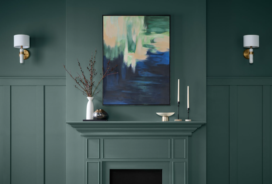
Hidden Gem - Behr color of the year 2026
The choice of green across Behr, WGSN, and Valspar isn’t accidental. To understand it, you have to look at the seismic shifts of the past few years. The pandemic shook global stability, Russia invaded Ukraine, women’s rights regressed in parts of the world, inflation soared, and geopolitical unrest escalated. In times like these, people subconsciously gravitate toward grounding tones. That’s why the early 2020s were dominated by earthy browns and warm neutrals — a cultural “back to the roots.”
This “back to the roots” movement is not a fleeting aesthetic — it’s a meta-trend cutting across culture, business, and geopolitics. In fashion, Dolce & Gabbana’s July 2024 Rome show looked more like a Vatican ritual than a couture runway. In entertainment, Netflix released Mary in December 2024, reviving biblical storytelling. In sports, Japan’s 2022 World Cup team left their locker room spotless, with thank-you notes in Arabic and Japanese alongside origami — gestures grounded in tradition. Rihanna returned to Barbados in 2022 to raise her first child close to family, while literature spotlighted ancient languages and imperial conflicts in R.F. Kuang’s Babel (an Instant #1 New York Times Bestseller, 2023). Music echoed this with Lady Gaga’s 2025 hit Abracadabra, built on an Aramaic phrase much older than “hocus pocus.” Even personal identity and family structures reflect this shift: Jennifer Lopez, in her fourth marriage, legally became Jennifer Affleck, emphasizing pride in tradition. In geopolitics, India’s Prime Minister Modi opened the 2023 G20 under the Sanskrit name “Bharat,” reclaiming pre-colonial identity, while recent wars have drawn from biblical imagery — Israel’s 2023 Iron Swords war, its David’s Sling defense system, and the 2025 confrontation with Iran dubbed Rising Lion, a direct reference to the Book of Numbers.
Color is part of the same continuum. Since the pandemic, earthy browns and warm neutrals have dominated across industries. Sherwin-Williams chose Urbane Bronze (2021), Evergreen Fog (2022), and Redend Point (2023); Behr selected Canyon Dusk (2021) and Blank Canvas (2023); while Pantone highlighted Viva Magenta (2023) with rich, grounding undertones. Fashion leaned heavily into camel, beige, and sand palettes from 2020 onward, with houses like Max Mara and Hermès making earth tones their signatures. Furniture and interiors followed suit, with Ikea and West Elm collections spotlighting warm woods, ivory, and linen. Together, these choices reinforce that the preference for stabilizing, grounding colors is not random — it is the visual expression of a larger cultural longing for roots, community, and continuity.
This grounding trend is still visible in recent color choices: Dutch Boy Paints selected Melodious Ivory, and Minwax went with Special Walnut, both reinforcing the appeal of warm, stabilizing tones. These choices form the first point in a visual timeline: neutral/earthy colors = search for stability.
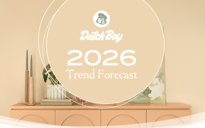
Now, the green shades chosen for 2026 by Behr and Valspar — closer to eucalyptus and khaki than to vivid spring grass — mark a cautious transition. They reflect not just a need for
stability but a tentative step toward renewal. It’s the visual language of resilience moving toward hope. This is the second stage: subtle greens = careful optimism.
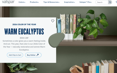
The most forward-looking signals come from WGSN and Coloro with their Transformative Teal, a blue-green/turquoise hue that leans into a more hopeful, expansive future. This is the third stage: blue-green/turquoise = aspirational optimism and societal renewal.
The green of 2026 is not the lush shade of a tropical forest, but a careful green of renewing ground — a color that indicates hope, yet keeps its feet firmly on the ground.
Finally, Pantone’s choice for the 2026 Color of the Year reinforces the same broader cultural picture. Pantone selected PANTONE 11-4201 Cloud Dancer — an airy, serene white that symbolizes calm, inward reflection, and a conscious move toward simplicity in an increasingly noisy world. This marks the first time in 26 years that a shade of white has been chosen, and it reflects two deep-rooted trends: minimalism as a response to excess, and a collective desire for quiet, peace, and escapism after years of stress, burnout, and instability. Rather than demanding attention, this color creates space — mentally, emotionally, and creatively.
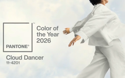
Seen through this lens, the rise of greens, warm neutrals, and now white is not accidental but part of a single, coherent trajectory: a shift from survival to grounding, and from grounding toward calm and cautious hope. If the greens of 2026 express careful renewal and forward momentum, Pantone’s white points to an equally powerful need to pause, reduce noise, and reclaim breathing room. Together, they signal a society seeking recovery — not through spectacle or high-energy escapism, but through simplicity, stability, and restrained optimism. For businesses, the implication is clear: brands, products, and workplaces that offer clarity, calm, and a sense of safety — not just innovation or intensity — will be best positioned to earn trust, loyalty, and long-term commitment.
If your company wants to understand how these cultural shifts, new rhythms, and next-gen preferences will impact behavior, products, and the market — that’s exactly what I do at Tectonic Shift.
Curious how these trends will affect you?
Send a message and let’s connect it directly to your business.
Happy & Colorful 2026!