
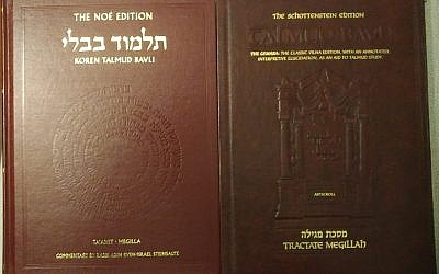
A Review of the Koren Ta’anit-Megilla by an ArtScroll User

The נאה edition lives up to its name.
The Koren Gemara was always going to have a hard time winning me over. Their main competitor, ArtScroll, has been a major part of my life and learning. After I finished mishnayos Seder Nezikin for my bat mitzvah using their mishnayos (and received a few other sedarim as gifts), their gemaras became my constant companions for middle and high school. My ArtScroll Masseches Taanis (Daf Yomi Edition) has several stickers on the front endpaper. They were given to me by a teacher for showing up early to davening when I was in seventh grade.
Given that strong emotional attachment, I tried to be conscious of my biases in writing this review. In the end, while the Koren isn’t the same as the ArtScroll, I have come to believe that each has its advantages.
Look and Feel – Outside
The Koren gemaras have slipcovers emblazoned with vividly colorful images appropriate to the massechet at hand. The Koren Ta’anit-Megilla’s image is the top of a megillah case. While the slipcover is pretty, though, you should probably take it off before using the gemara. Mine began to rip even in the first few days, before I had taken it out of the house. Once I started traveling with it, the top began to shred. The slipcover as a whole also became discolored and stained from other things in my bag, so after a few weeks, I just took it off.
My full-size Koren Ta’anit-Megilla is a little shorter and thicker than my full-size ArtScrolls. The Koren’s paper feels sturdy and fairly thick (very different from the Koren Tanachim and siddurim I’ve owned). Under the dust jacket, I think it looks similar to the ArtScroll. It’s heavy, but not too heavy – as with the full-size ArtScrolls I’ve used, the weight wasn’t a problem for me in carrying it around on my daily commute, though YMMV.
I did notice that the cover was thinner than my Artscrolls’ covers, though not by much. Combined with the slightly thinner paper and my experience with other Koren products, I was constantly worried that the spine would break. While that never happened, the corners did begin to bend inward, and the edges of the pages became somewhat discolored.
In general, the Koren feels less like a sefer to me, even without the slipcover. This is partly because the English section of the book opens like a standard English book, rather than like a Hebrew one. (Like the ArtScroll travel edition, the Koren has the tzuras hadaf and the translation in separate sections. I always disliked this aspect of the ArtScroll travel editions, and my feelings are unchanged. But I do understand that the general ArtScroll approach uses a lot more paper. Similarly, I acknowledge that opening the translation section from the English side is more intuitive for many people.)
Look and Feel – Inside
The thing that immediately stands out to me as a longtime ArtScroll user is the color. The headers are a light pinkish-beige, “MISHNA” and “GEMARA” are printed in rose, and there are images everywhere. The overall effect is definitely aesthetically pleasing. (NOTE: Only the full-size edition has this feature; the smaller size is in black and white.)
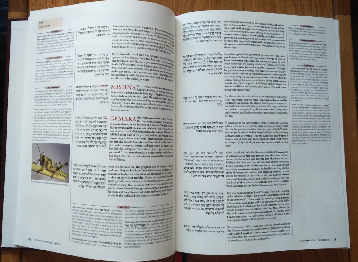
Another thing that stands out is how different the formatting is. Unlike ArtScroll’s phrase-by-phrase breakdown, the Koren is arranged as short passages from the gemara next to their translation. Similar to ArtScroll, the literal translation is bolded; unlike ArtScroll, there’s no way to distinguish visually between Amoraic and Tannaitic statements (Artscroll has the latter in all caps). While I really miss knowing a source’s type at a glance, the Koren looks cleaner and more ordered to me, and I found it easier to keep my place.
Little things – “Ta’anit” vs. “Taanis,” “Rabbi” vs. “R'” – will probably make a big difference to the comfort level of some readers.
I was sometimes concerned that the focus on aesthetics impeded the book’s functionality. For instance, nearly all the paragraphs (in the English) are roughly the same length. This looks very neat, but it means that dialogue is broken up in seemingly random places rather than when changing speakers. Here, for instance, I had trouble keeping track of the speakers:
Similarly, when a friend and I were learning a (non-Taanis) gemara on Sefaria (set to Hebrew-only) recently, I noticed that the breaks in the text (which are the same as in the Koren) were negatively affecting my reading comprehension. More than once, I stopped halfway through an internal sugya unit expecting that to be the end because the highlighting ended there, only to realize seconds later that the part I had read was not properly understood without the following highlighted section.
Since I am not really the intended audience for the Koren, I decided to ask some people who were closer to being part of it. I went into the CCNY Jewish Studies department and asked two people eating lunch there for a minute of their time to look at the Koren and ArtScroll. They liked the Koren aesthetic. At first glance, they found the Vilna page in the ArtScroll intimidating, but they found the ArtScroll’s English page less intimidating than the Koren because of its comparative simplicity. They also preferred the phrase-by-phrase translation and said they didn’t find the ArtScroll particularly difficult to understand (admittedly they only read a paragraph or two).
Translation
Here is where I simply couldn’t be reconciled to the Koren. I found the translation to be sloppy and inconsistent, and I was frequently confused by the choices made by the translators. For instance, I was inclined to give the translation the benefit of the doubt that it was simply committed to being literal when it translated “tanna hasam sleik” as “the tanna interrupted a discussion there” and “tanna heicha ka’ei” as “where is the tanna standing,” but then it translated “mai mashma” as “from where is it inferred.” I was similarly confused by the mismatch between “Eighth Day of Assembly” and “Simhat Torah.”
One major problem with the Koren is the general aversion to transliteration. While this does remove a linguistic barrier between the book and the reader, it erects one between the reader and anyone discussing the sugya who has read it in the original (or even in the ArtScroll). “Prayer leader,” “morning prayer,” and “additional prayer” are not only not the terms a knowledgeable Orthodox person would use in describing a sugya to their colleague, they are so far removed (and so vague) as to impede communication between that Orthodox person and someone who has only read the Koren’s English.
Commentary
The Koren’s notes are separated into “Notes,” “Background,” “Language,” “Personalities,” and “Halakha.” These are all jumbled together in ArtScroll’s footnotes. Unlike Artscroll (and necessitated by this organization), Koren’s notes have dibburei hamatchil rather than numbers, which I quickly got used to.
I was surprised at how artificial the divisions between commentary sections in the Koren felt. I often couldn’t predict which information would appear where. Sometimes the sections were seemingly redundant.
I really liked the Language and Personalities sections, which supply the reader with essential background knowledge. However, I was often unsure how the specific words and personalities focused on were chosen, and the lack of citations in the latter section bothered me. I believe strongly that a good study aid should be an invitation to further research, not a substitute for it.
As with the translation, I was frequently baffled by the choices made in the commentary. For instance, on daf 2b, there are notes explaining what a lulav is and what nisuch hamayim was. There are two images. Both are of nisuch hamayim vessels (one a reconstruction, one an image on a Bar Kokhba-minted coin). I don’t understand why one of them wasn’t a lulav.
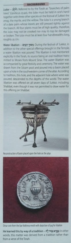
I was similarly unsure why the lulav note chose to mention that “the lulav may not be crooked nor may its top be broken” and that “the lulav must be at least four handbreadths long, roughly 35 cm” instead of mentioning, as the ArtScroll does, that the four plants are collectively referred to as the “four species” and giving their Hebrew names. The technical requirements are not relevant to the context, nor are they likely to be the first things a reader new to the concept wishes to know. And unlike the ArtScroll comment there, the Koren does not explain how the lulav is connected to the sugya, which (in my opinion) is far more likely to be the question burning in the reader’s mind.
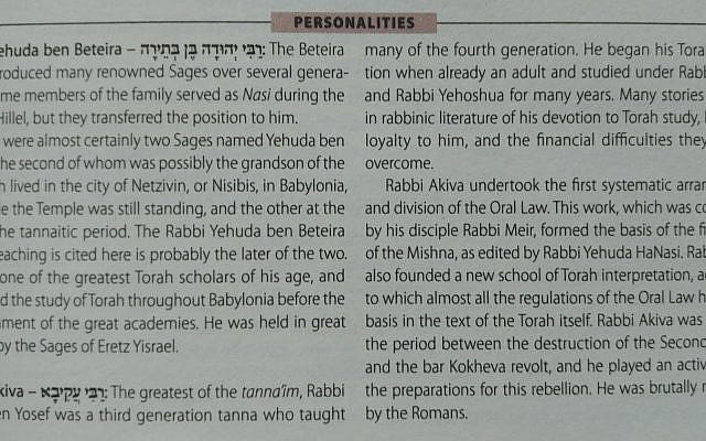
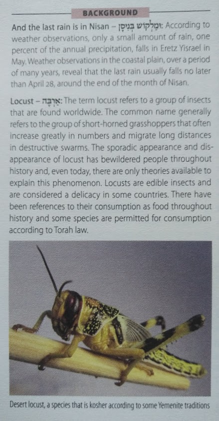
I was never quite sure what tone the commentary was aiming for. At times it seemed objective and academic, as in its explanations of rain patterns and locusts, but it also called R’ Akiva “the greatest of the tanna’im,” which seems anything but.
Other Things
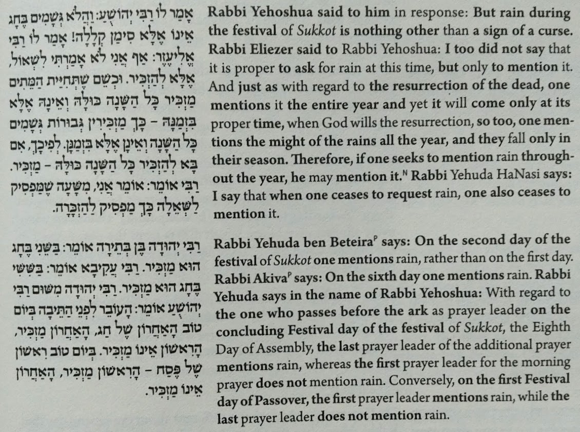
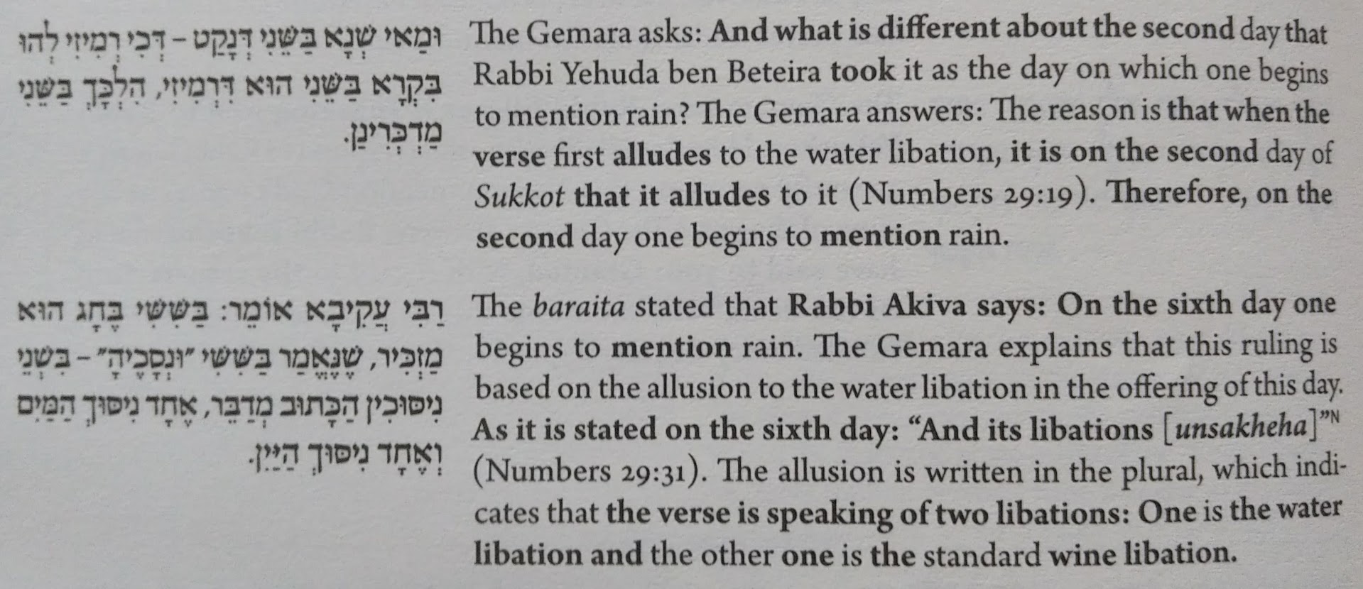
The punctuation in the Hebrew paragraphs in the translation section seemed random at times. In the image below, for instance, I am unsure why the first dash isn’t a question mark, as it is in the translation.
The Koren doesn’t always indicate when a new sugya begins. As far as I can tell, it reserves its new-topic symbol for when the gemara begins discussing a new text. I frequently found this confusing.
Buy the Koren if
- You intend to primarily use the (menukad) Hebrew section and only occasionally glance at the English section
- You like their layout
- Illustrations are important to you
- You really can’t stomach the thought of buying an ArtScroll